Organizing typography to ease development
TyPoGrApHy. It’s important and hard to get right. Having recently selected a new serif heading typeface, the product design team looked to maintain consistent usage of all of our typography as part of Snorkel design system. We decided to start with headings. This post focuses on the technical Sass implementation method we chose.
The design audit
The first step was standardizing typography styles across our site to ease their integration into our design system.
An audit of current headings revealed we were often inconsistent with their usage. It found two font families: Meta Serif Pro and Proxima Nova (Woo! That’s not a lot.) — but also a wide range of font sizes, styles and weights.
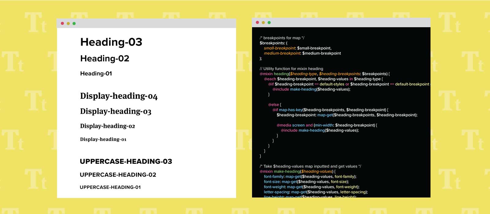
From the audit, there were three main heading styles we were using: Standard (sans-serif), Display (serif) and Uppercase. Within these buckets, I proposed font sizes that would achieve the hierarchy demanded of each heading on our site. These discussions with the team included live demos and feedback regarding heading usage on site pages.
Once the feedback was resolved, I added the three distinct headings to our Sketch library as text styles for use in future components and page designs.
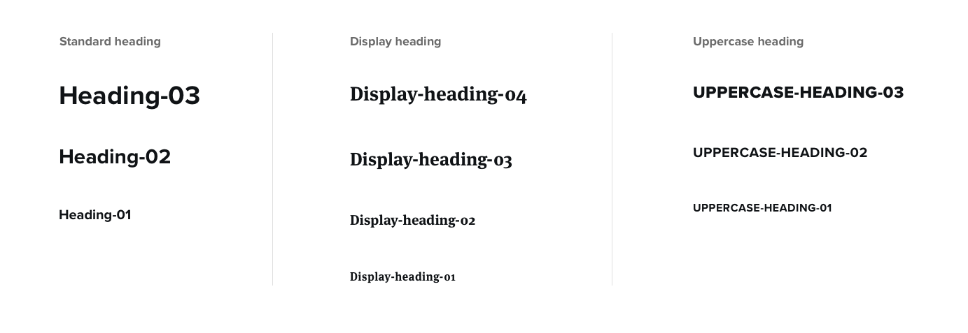 We standardized three heading styles and included responsive sizing.
The implementation
Now that we had defined our headings, I needed to implement the new standards across the site while ensuring easy integration with our design system and mockup process. Research, Research, Research. So much research. I wasn’t the first person with this goal in mind, and many design systems recommended their own scales and methods for implementation.
From the design systems I sampled, a theme emerged of divorcing styling from HTML header elements. This gives developers the freedom to use semantic HTML without concern for design.
With that decided, I was still unsure how I would scale our typography properties across the codebase. I didn’t want to just create variables for size, weight and line-height as they needed to be grouped consistently within selectors and remain consistent across different screen sizes. I finally found a Smashing Magazine article by developer and designer Jonathan Suh. He suggested using Sass maps with a mixin, and his solution is the best I found to keep our code DRY.
WARNING: I’m about to briefly explain Suh’s approach. If you’re unfamiliar with Sass maps and mixins or just want the full tutorial, go give the article a quick read!
Suh mapped breakpoints using a Sass map. He began by defining keys (the names of the breakpoints) and their associated values (the numerical breakpoints) in a breakpoints map. He then called back to those breakpoint keys within heading maps to define each breakpoint’s font size (value). A mixin checked the font size maps for corresponding breakpoint keys and printed the media queries with the correct values.
Suh’s code:
$breakpoints: (
    small : 480px,
    medium: 700px, // Previously 640px
    large : 1024px
);

$h1-font-sizes: (
    null  : 28px,
    small : 31px,
    medium: 33px,
    large : 36px
);

@mixin font-size($fs-map, $fs-breakpoints: $breakpoints) {
  @each $fs-breakpoint, $fs-font-size in $fs-map {
    @if $fs-breakpoint == null {
      font-size: $fs-font-size;
    }
    @else {
      // If $fs-font-size is a key that exists in
      // $fs-breakpoints, use the value
      @if map-has-key($fs-breakpoints, $fs-breakpoint) {
        $fs-breakpoint: map-get($fs-breakpoints, $fs-breakpoint);
      }
      @media screen and (min-width: $fs-breakpoint) {
        font-size: $fs-font-size;
      }
    }
  }
}
Slightly different from Suh’s initial goals, we wanted to define all properties of each heading within our breakpoints. I found the array approach to solve this problem, suggested at the very end of his tutorial, hard to read and wanted a more scannable and clear semantic outline. To accomplish this, each of my maps contained nested maps with clearly named keys and their corresponding values.
After creating the breakpoints map, I began mapping all of our heading variations. I found that styles within my heading buckets were often being repeated. For display headings, all font-families should be serif and for uppercase headings, the text-transform should always be uppercase. We wanted our mixins to represent the entire text style, but the code was getting progressively less DRY.
Notice the styles in the default breakpoint repeat for each heading variation:
$display-heading-style-04: (
    default-breakpoint: (
        font-family: $display-font-family,
        font-size: 1.75rem,
        font-weight: 700,
        line-height: 1.2,
        margin: 0,
    ),
    small-breakpoint: (
        font-size: 2.75rem,
    ),
);

$display-heading-style-03: (
    default-breakpoint: (
        font-family: $display-font-family,
        font-weight: 700,
        font-size: 1.625rem,
        line-height: 1.3,
        margin: 0,
    ),
    medium-breakpoint: (
        font-size: 2.125rem,
        line-height: 1.3,
    ),
);
My solution was a map exclusively for bucket-level styles that were independent of the media queries; I called these the “default-styles.”
The new maps created one source of truth to reference for each text-style’s base and fundamental properties:
$display-heading-style-default: (
    default-styles: (
        font-family: $display-font-family,
        font-weight: 700,
        margin: 0,
    )
);

$display-heading-style-04: (
    default-breakpoint: (
        font-size: 1.75rem,
        line-height: 1.2,
    ),
    small-breakpoint: (
        font-size: 2.75rem,
    ),
);

$display-heading-style-03: (
    default-breakpoint: (
        font-size: 1.625rem,
        line-height: 1.3,
    ),
    medium-breakpoint: (
        font-size: 2.125rem,
        line-height: 1.3,
    ),
);
I now needed to make my clean code operational. The maps were separate, so I Googled how I might combine them and found map-merge. At the bottom of my file, I merged each variation map with my default heading styles map to create my final maps. (Note: Turns out you can’t merge nested maps. I would have loved to call “default-styles” “default-breakpoint” in my default style map, but the nested maps would not merge into each other.)
$display-heading-04: map-merge($display-heading-style-default, $display-heading-style-04);
$display-heading-03: map-merge($display-heading-style-default, $display-heading-style-03);
After the maps were merged, I created a list of all properties I had defined as keys in my maps to be included in my heading/breakpoint mixin. They used map-get to grab the values associated with each key. I then added a checkpoint to the mixin for default styles, so the heading styles were included without a media query. The check wrote my styles once for all screen sizes.
My final mixins:
@mixin make-heading($heading-values) {
    font-family: map-get($heading-values, font-family);
    font-size: map-get($heading-values, font-size);
    font-weight: map-get($heading-values, font-weight);
    letter-spacing: map-get($heading-values, letter-spacing);
    line-height: map-get($heading-values, line-height);
    margin: map-get($heading-values, margin);
    text-transform: map-get($heading-values, text-transform);
}
/* heading-type passes in the heading variation */
@mixin heading($heading-type, $heading-breakpoints: $breakpoints) {
/* Each breakpoint map in the heading variation */
@each $heading-breakpoint, $heading-values in $heading-type {
/* if the map == default-style or default-size, print map contents */
@if $heading-breakpoint == default-styles or $heading-breakpoint == default-breakpoint {
@include make-heading($heading-values);
}
@else {
/* if the heading variation has a breakpoint map that matches the breakpoints, get the breakpoint */
@if map-has-key($heading-breakpoints, $heading-breakpoint) {
$heading-breakpoint: map-get($heading-breakpoints, $heading-breakpoint);
/* Apply breakpoint to media query and print the map's contents */
@media screen and (min-width: $heading-breakpoint) {
@include make-heading($heading-values);
}
}
}
}
}The final step was putting all of this code to use. I removed all existing heading styles in components and added the mixin include. It turned out many of our component media queries existed solely to support changes in heading font size.
.feed-header {
    &__title {
        @include heading($display-heading-03);
    }
    &__description {
        margin: 0.5rem 0 0 0;
    }
    &__divider {
        background: $dive-grey-2;
        border: none;
        height: 1px;
        margin: 1rem 0 2rem 0;
    }
}
CSS output:
.feed-header__title {
    font-weight: 700;
    letter-spacing: .5px;
    margin: 0;
    text-transform: uppercase;
    font-size: 1.5rem;
    font-weight: 800;
    line-height: 1.2;
}
@media screen and (min-width: 64em){
    .feed-header__title {
        font-size: 1.75rem;
        line-height: 1.2;
    }
}
I also created helper classes for headings disconnected from components.
.display-heading-04 {
    @include heading($display-heading-04);
}
The result of this experiment with Sass maps and mixins was powerful. We can now reference our standard headings from any design system component. And for stand-alone headings, we can use helper classes to maintain consistent styling with our components. Next stop for Snorkel: margins and padding.