Improving the UX of our advertising specifications page
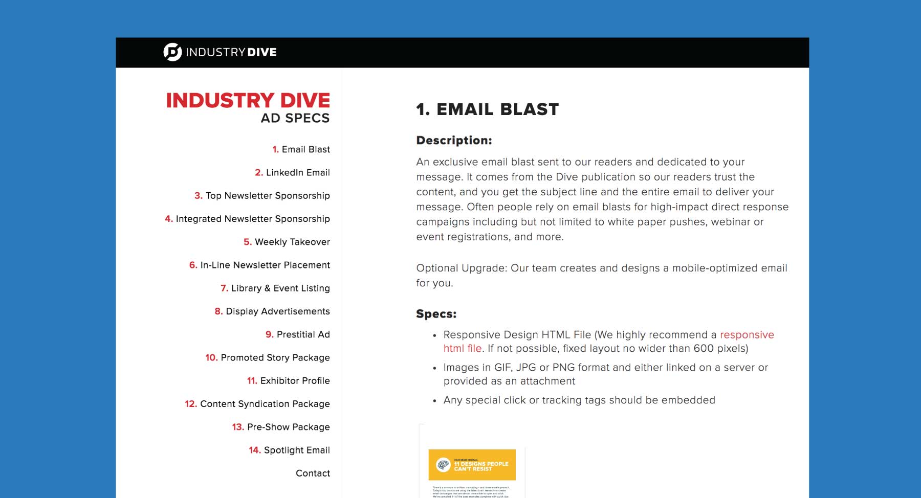
In 2016, Industry Dive wanted to ease the process of how our teams communicate with clients about the design and specifications of our sponsored products and advertisements. To mitigate unnecessary communication and inconsistent messaging, we created an ad specs page. The page allows team members to show clients their purchased placements and provide an image of the offering with a list of the copy requirements and assets needed.
During a user experience audit, we found the tool was being used with clients differently than we had initially intended. Clients were only interested in products they had already purchased from our media kit, making our navigation and information around other offerings confusing to them. We also discovered the design was not scaling with our company’s outlook for upcoming placements and product launches.
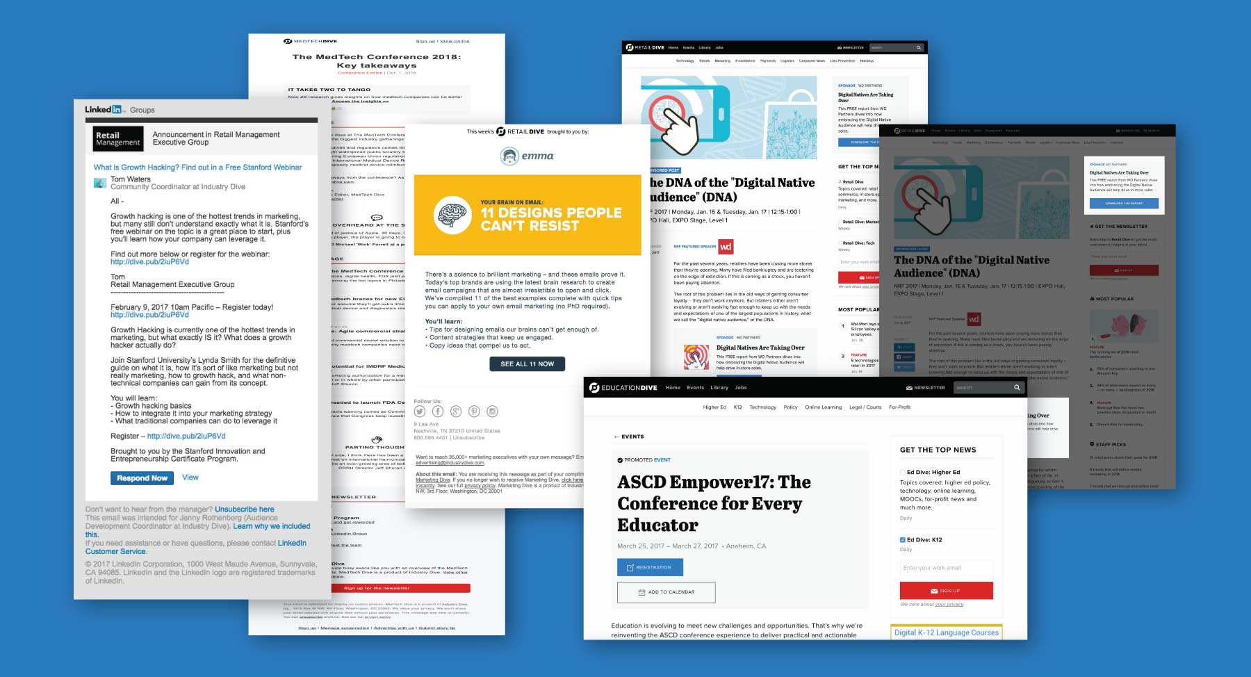
 The first version of the ad specs page that allowed for same-page navigation.
NAVIGATION
Expected Behavior:
Initial interviews with our users assumed clients would peruse the guide and sales team members would direct them using the numbers in the left sidebar navigation. When a list item was clicked, users would be dragged down to the placement or product they were interested in.
Actual Behavior:
Clients only wanted to see the specs for what they had already chosen from our media kit. In response, sales and ad operations would send the client a direct link. He or she was then directed to the top of the section indicated in the link. They did this for each placement sold.
However, the link didn’t remove other offerings from the page. Clients would often become confused on scroll as they still had access to all of our placements on the same page. They didn’t understand where the information necessary to them began and ended. Thus, client and sales representative time was wasted on clarification of the relevant information and additional questions about offerings they did not choose from the media kit.
Solution:
Our solution was to provide the client with only pertinent information about their campaign to reduce confusion.
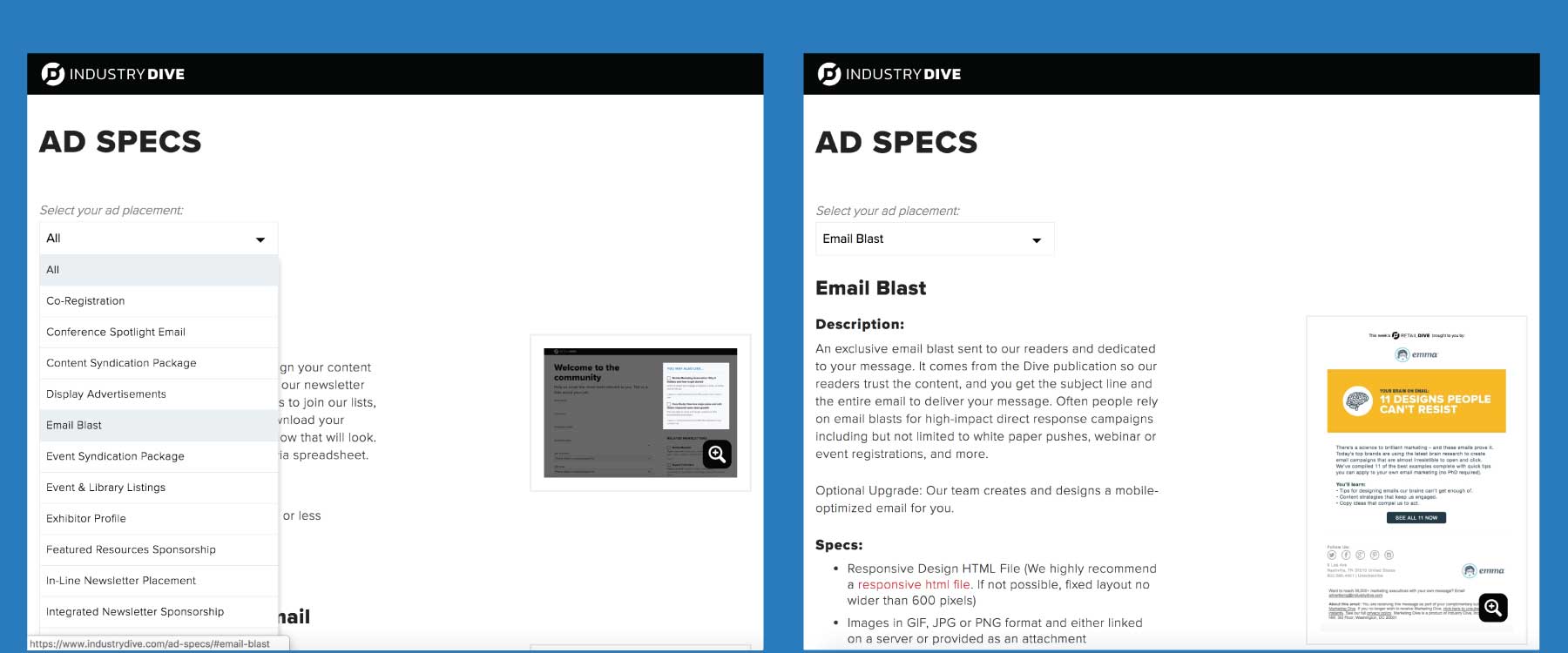
We accomplished this by removing all other sections on the page when a product was selected. Sales representatives couldn then share a link with clients that would only display the chosen ad unit.
 The second version of the ad specs page that accounts for changing user needs.
SCALABILITY
Expected Behavior:
Our product offerings would scale at a steady pace that the page could manage.
Actual Behavior:
We added more products than expected. As a result, the user experience began to suffer. The sidebar overflowed on certain screen sizes and caused an issue on mobile where it lived statically at the top of the page.
On mobile, scroll felt infinite. It created friction for users reading emails on their phone, desiring to quickly collect the information they were looking for.
Solution:
With the goal of making our page scalable to our increasing product offerings and a better experience for mobile users, we created a drop down to filter the products. It then displayed only the selected section to reduce the amount the user had to scroll to achieve his or her goals.
As companies grow, it’s important to revisit designs to ensure they meet the changing goals and needs of their users. Designs also often provide a great user experience but might need adjustments when put into practice. For these reasons, we’ve found it’s essential to revisit the success of product designs over time and make enhancements to continue improving user flows.