Dive Awards 2017
This past year marked the second year Industry Dive published the Dive Awards, a look back at the year and forecast for the future of each publication site’s industry. In 2017, we revamped the Dive Awards brand and our editorial strategy.
While the entire company supported the effort, the design team played a central role in its execution. To kickoff the project, I met with a few members of our editorial team. Our editors choose the Dive Awards winners and wrote analyses to support their decisions, making them key stakeholders. Together, we wanted to enhance this content and its visibility.
To move forward, we looked back at where we could improve.
- Scannable Content — The 2016 Dive Awards lived on one page per publication and winners were not clearly visible, making the awards difficult to scan.
- Storytelling — Editors were left with a tight word limit and minimal assets that didn’t always do justice to the award winner’s story. While we wrote clear narratives using original content, we often used images and data/graphs from reports that were not specific to the stories we wanted to tell about each winner.
- Branding — There was no overarching brand to create a cohesive vision. We had a Dive Awards logo that our audience team sent out to winners, but the logo appeared nowhere on our site.
- Differentiating the Content — Dive Awards content on the home and article page looked like a standard feature story.
This year, we chose to rethink our approach to Dive Awards. Each award would have its own dedicated page with a connected landing page that served as a collection of all the awards. The new structure would give editors more freedom to tell the stories of our winners and a place for our readers to scan the awards.
I met with editors to define requirements and goals. We settled on a reformatted article and approach that would allow readers to more easily consume our content. We decided to take the old guiding principle “don’t bury the lead” one step further by pulling out the most important information in each piece. We achieved this in two ways:
- Quick Facts — Each award would have its own set of “quick facts” at the top of the article. These facts would contain a combination of important information about the award winner and the reason they received the award.
- Graphics — Each story would be required to convey information in at least one graphic. These graphics ranged from a table to an interactive svg.
GRAPHICS
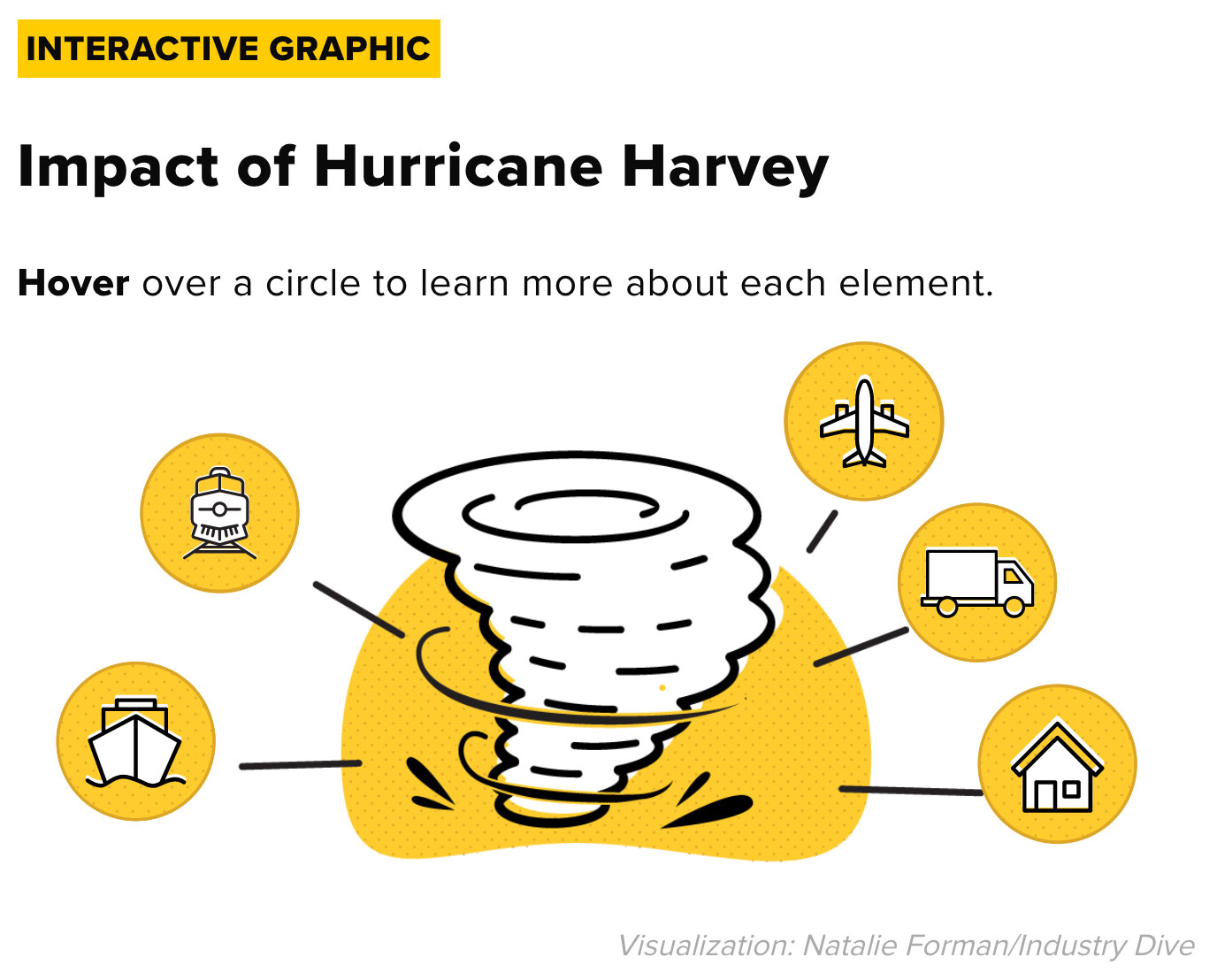
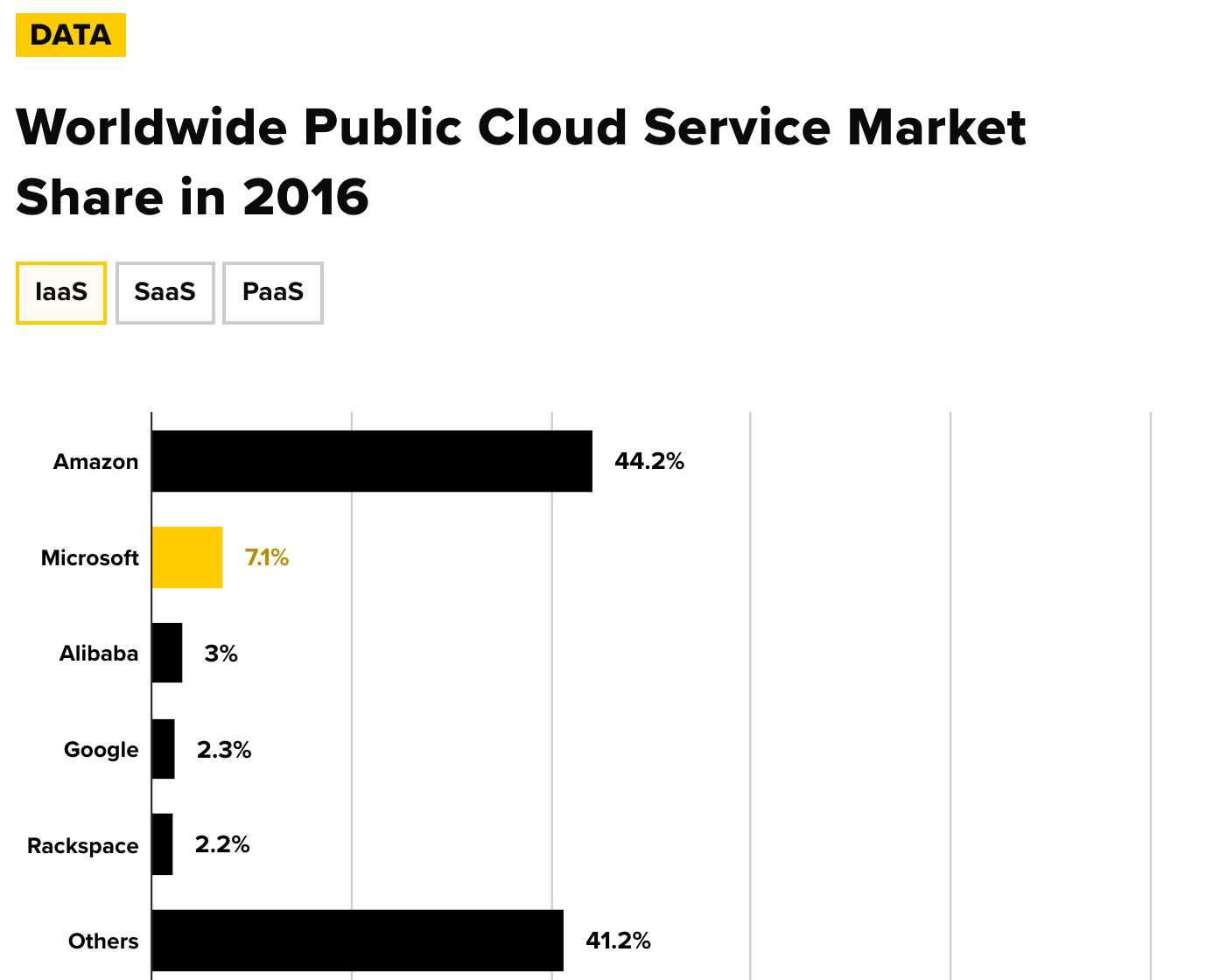
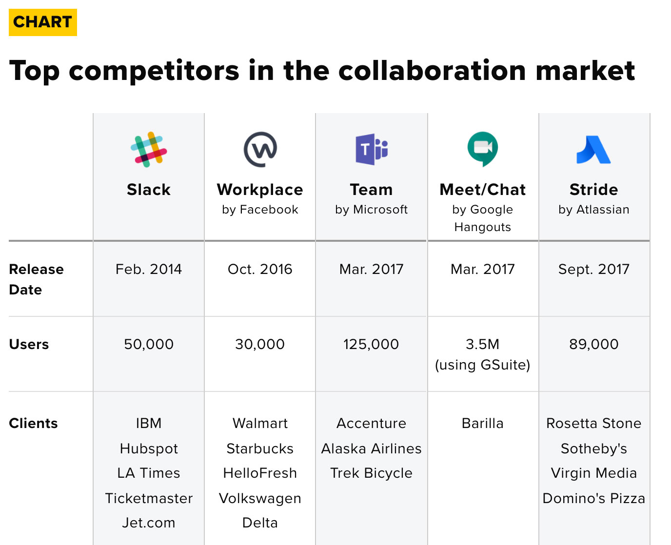
Front-end designers Natalie Forman, Nan Copeland and I created interactive graphics and data visualizations to help editors tell their stories.
Once we developed a cohesive idea of the experience we wanted for our readers, I began designing around our requirements to unite the Dive Awards articles and differentiate them from our year-round content.
Branding
As a B2B media company we are often looking for a clean and professional approach with a fun twist. When thinking about creating a brand that would stand apart from the rest of our site, I considered color. My personal color association for an award was gold (probably because I didn’t get first place most of my life and those memories have really resonated with me). Gold also contrasted well with our brand color #D62828. So #FFCC00 it was.
Now I had to decide how I’d incorporate that color into my designs. Yellow presents a key problem in design – it’s difficult to read. Knowing this, I used the gold as the background color for the identifying label of Dive Awards stories and the key content within each story. These descriptive “flags” became a central part of the Dive Awards design patterns. When used to call out a section of text, I often paired the labels with iconography to give readers an idea of what to expect from the content.
I chose a shape that would hold color but also stand in for color in its absence and provide an identifiable mark of the awards. The ribbon tail came into play on our navigation, ads, arrows and, finally, pulled the project together in the logo (see logo and ads).
Our graphic design team then took inspiration from our style guidelines to create a logo that would be used on the site and in promotional material sent by our audience development team. We also used this logo to create our custom in-house ads for the Awards in an effort to achieve higher brand recognition.
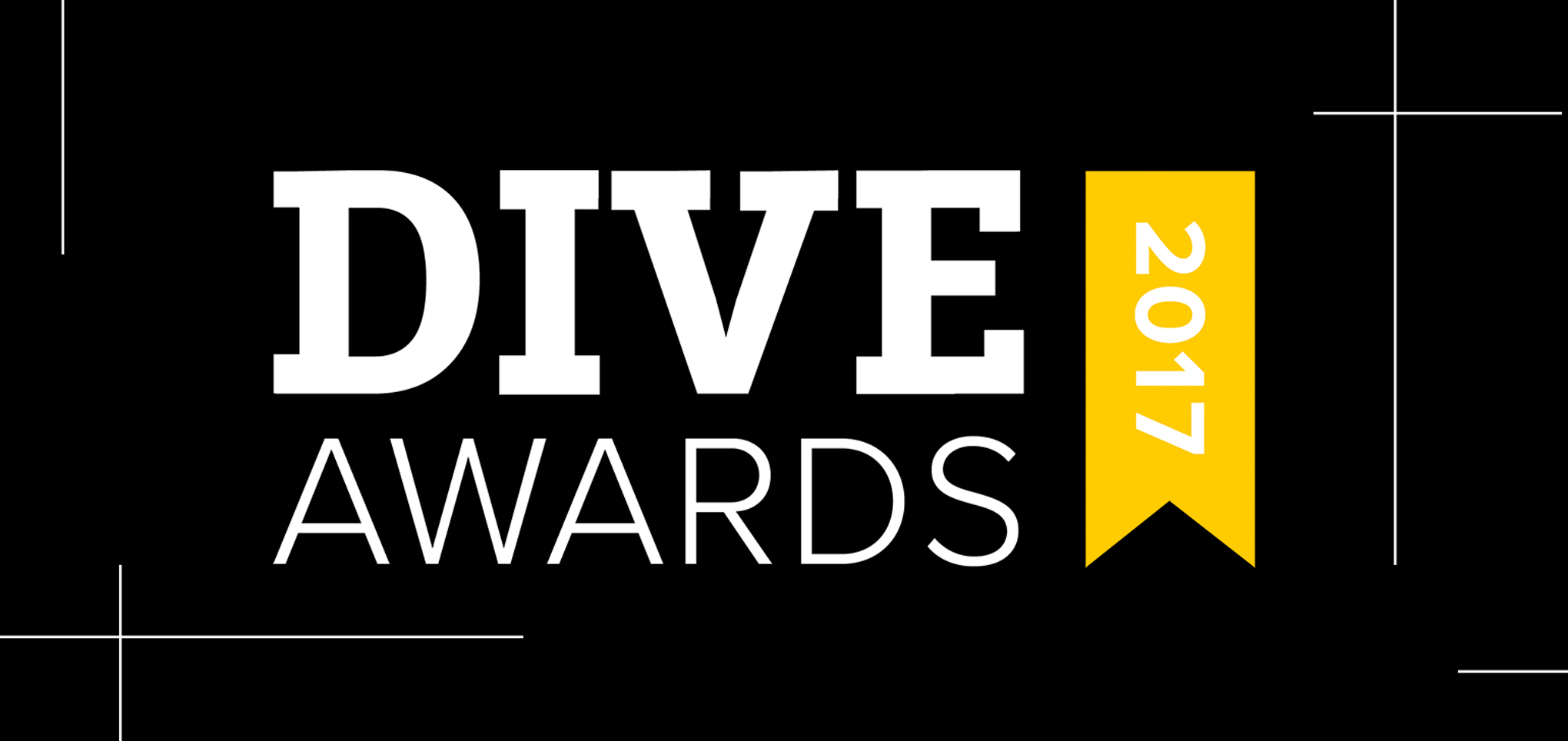
LOGO
![]() Logo created by Graphic Designer Elizabeth Regan to unite the 2017 Dive Awards brand.
Logo created by Graphic Designer Elizabeth Regan to unite the 2017 Dive Awards brand.
Interaction
We wanted the awards to resonate and provide users with a memorable experience that they would want to continue to engage with. I thought about interactions and our goal of getting readers to navigate between the awards and the landing page.
I recalled Uber’s CTA button design; I’ve hovered on those buttons more times than I’ll admit in print. In a bid for increased engagement, I applied a left to right motion across the project. The motion would act as a glue for the user, further creating a standard design pattern to differentiate the Dive Awards.
SLIDING PATTERN
 The sliding interaction to indicate links and unite the Dive Awards stories appeared throughout the project.
Navigation
The change in format from a single page to a page per award and a uniting landing page presented navigation challenges. We would need to add clear access points to related content — other awards stories — to prevent our readers from navigating away from the site.
ADS
 These ads were used to promote and link the Dive Awards across our site.
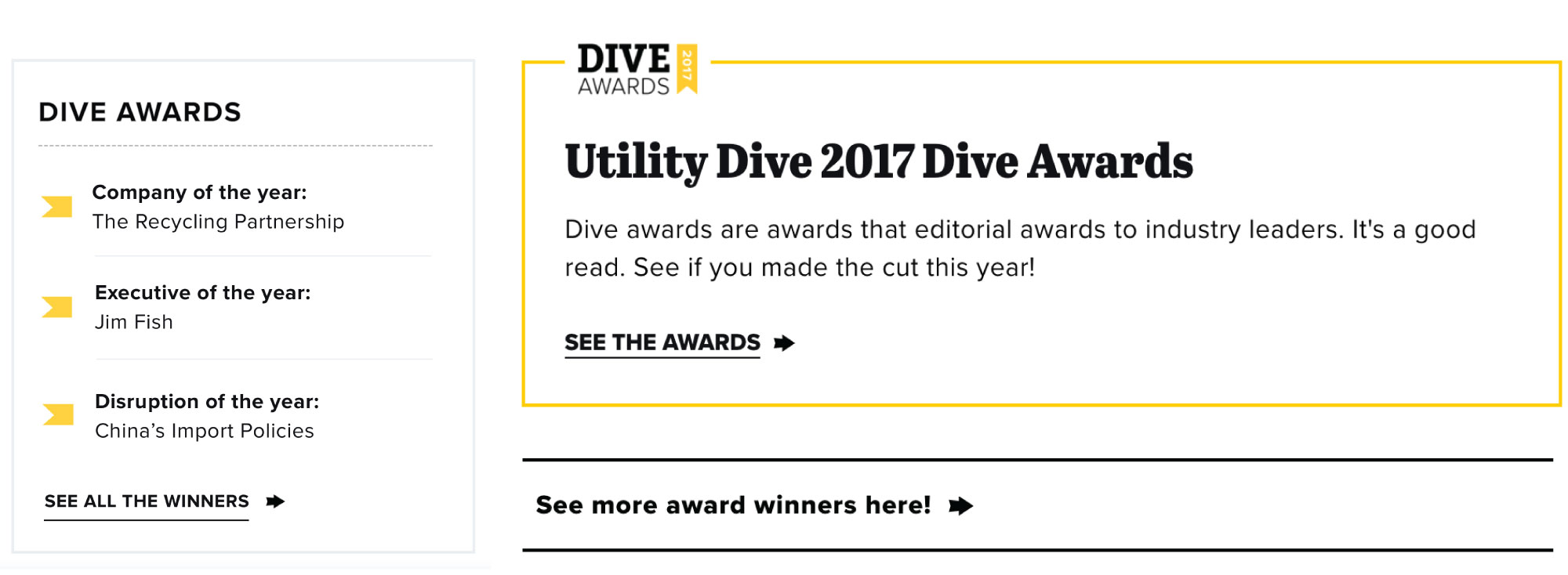
Sidebar Ad — Working within our article framework, the best way to implement navigation would be through the sidebar. I created an ad that would tease and link to three awards with a CTA to see all awards on the landing page. The sidebar box would need to strike a delicate balance between grabbing our readers’ attention and being perceived as a valuable piece of content.
To help make the box look native, I began with our current sidebar style template for Most Popular. I listed three awards, providing separation with a simple gold bullet to avoid using numbers as the awards were by category. In review, a graphic designer suggested the tail of a ribbon, which became the inspiration for our logo. A CTA to the full landing page was also included at the bottom of the box and carried the same style and motion as the inline CTA.
Inline Ads — I recognized some of our users might have banner blindness. For this reason, I also created inline CTAs. An inline CTA was made to go between stories on our homepage. I wanted it to look like special content, but also feel similar to the rest of our editorial content. I used the gold to draw attention to it and kept many of our feed styles to make it look native.
The other inline ad, however, would prove to be the most successful. It was plain text and lived about three paragraphs into our content. I simply bolded the inline ad and added the arrow motion to our CTA. Additionally, its language mimicked the design pattern of being simple and straightforward.
Landing Page
To improve scannability, we wanted a list and decided to forego images in the body of the page. Each new award link would be demarcated with a yellow bullet, that would slide across the word on hover. This would be that twist of fun and incorporate the sliding motion mentioned earlier.
LANDING PAGE
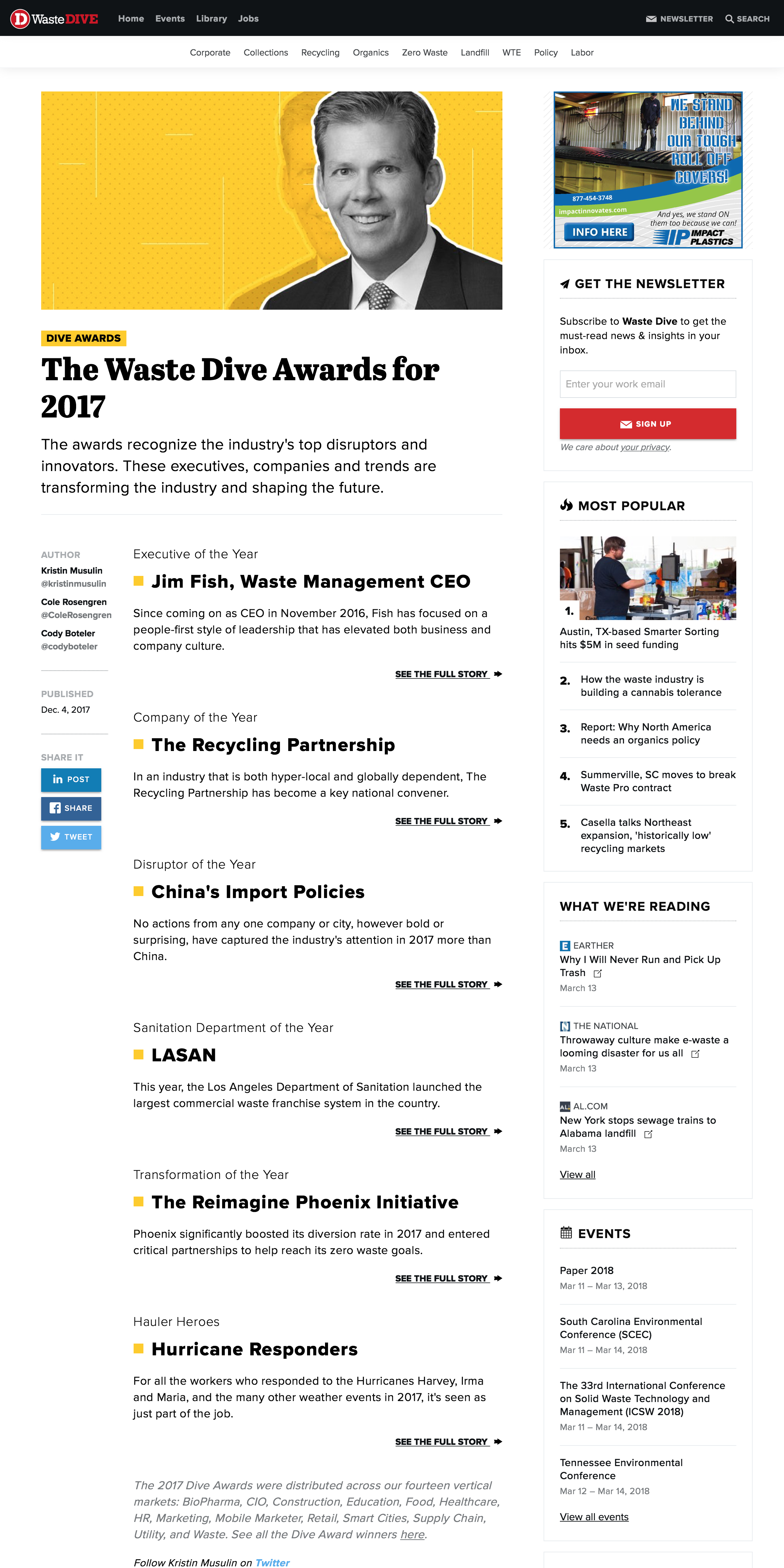 This page served as the hub for each publications awards. See full article.
But the page still needed one more thing: a commanding header image that would grab our readers’ attention, tying together the theme and highlighting one of our big winners for each publication. For this element, Senior Graphic Designer Kendall Davis came up with a graphic treatment, combining photography and vector patterns. Our landing page could now stand as the anchor for each publication’s awards and provide an exciting introduction to Dive Awards that we wanted.
HEADER IMAGES
 These header images were created by Graphic Designer Kendall Davis.
Article Design
The article page is arguably the most important of the project. Our reader would likely land on this page and spend the most time on it before deciding whether to explore our site further. We had to make an impact.
First, I needed to bring the Dive Awards brand to the page. Where our content was once labeled “Feature” in red, it would be labeled “Dive Awards” with a gold flag. Other key sections and visualizations or call outs would receive the same treatment.
I turned my attention to the quick facts that would appear at the top of each story. To achieve quick, scannable facts I designed them to break from the article grid and be larger than typical content. I then allowed for longer facts beneath the grid. I added a timer icon and the signature gold flag to help explain our goal to the reader.
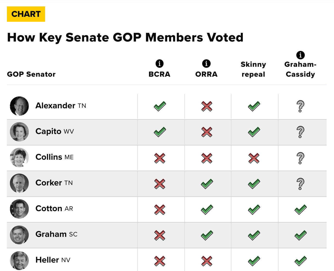
ARTICLE PAGE
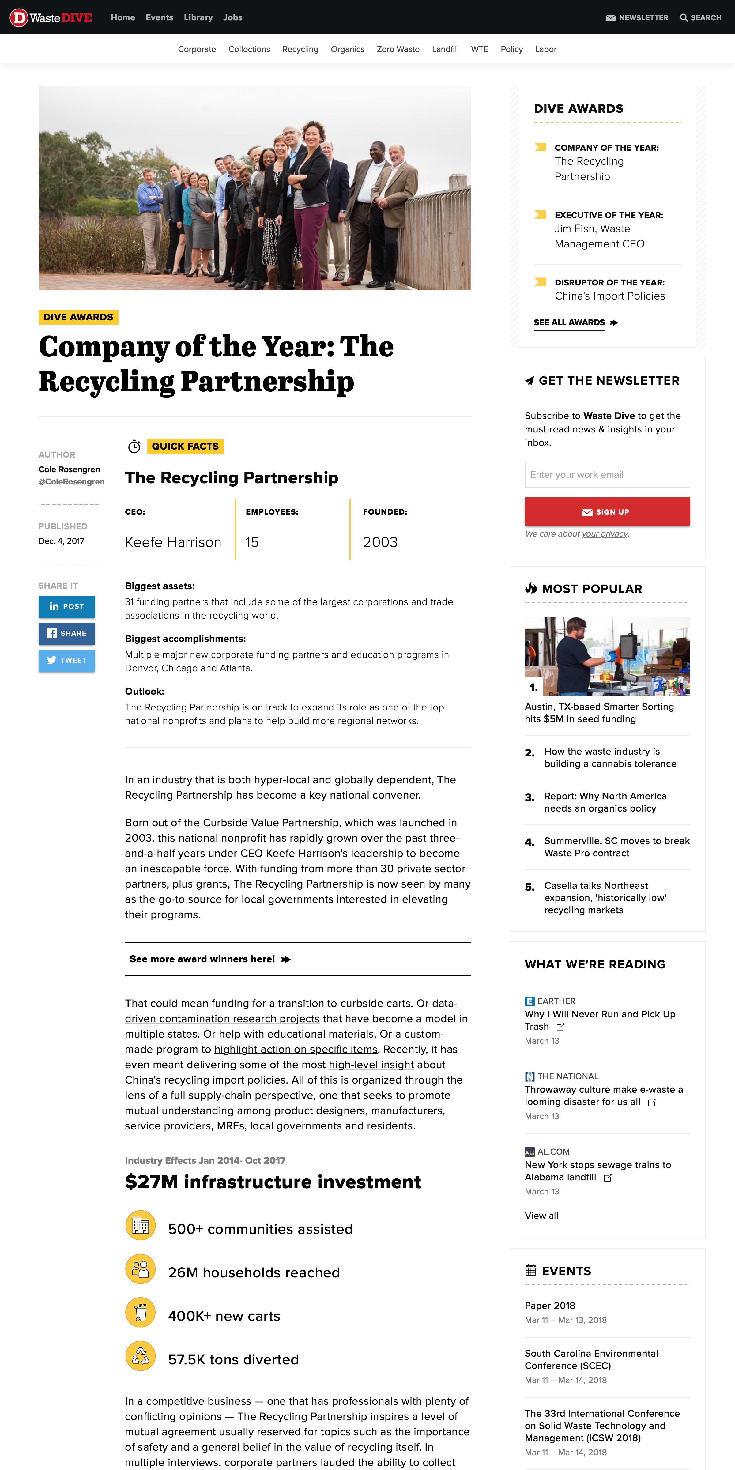 The article pages were the most important part of this project. Here lived the editorial content that made the Dive Awards a success. See full article.
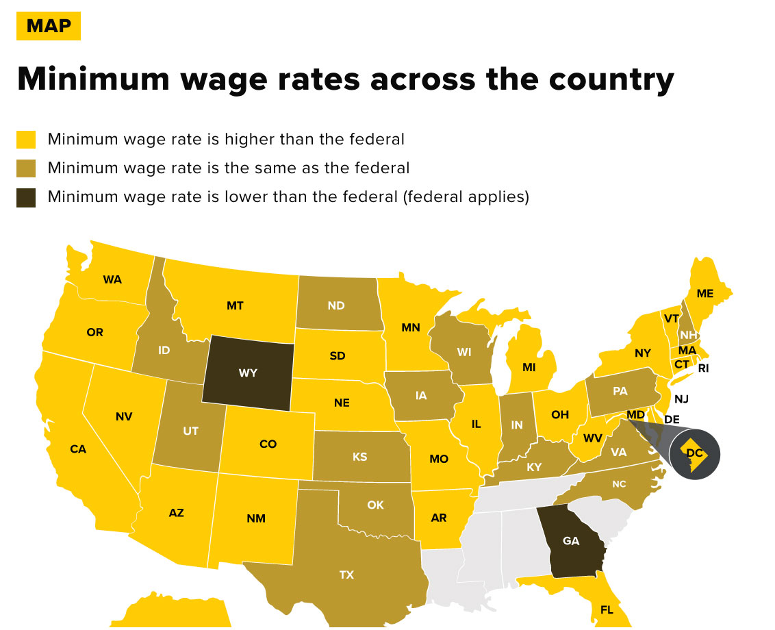
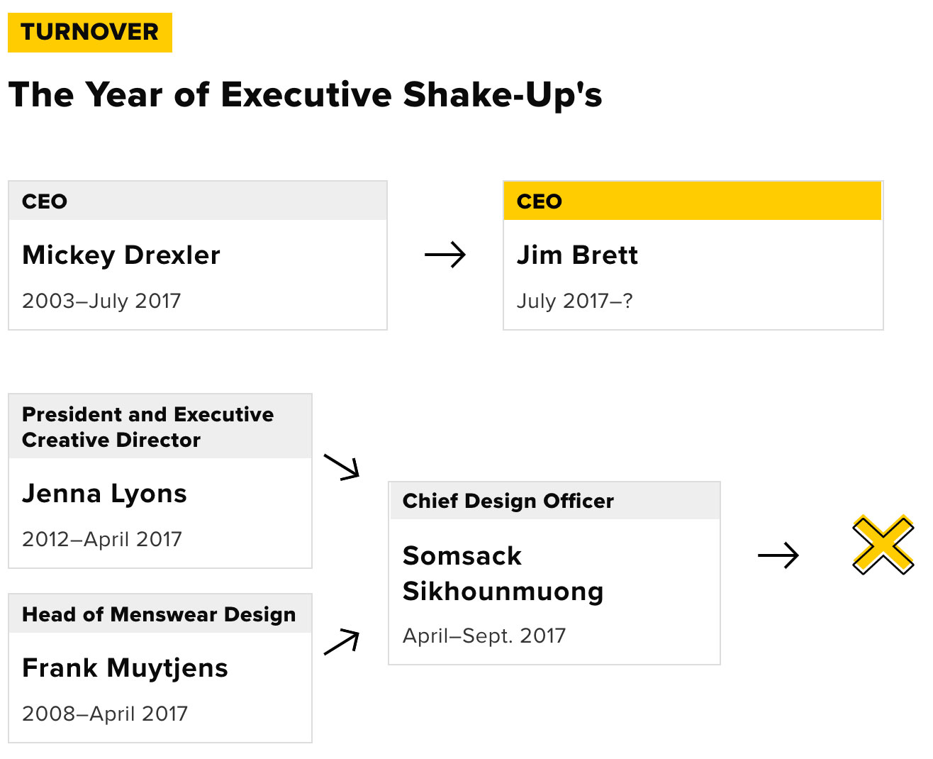
To assist in pulling out and visualizing additional key information, the design team created custom in-story graphics. Some marked key moments in the year for the event, person or company, others showed the numbers behind their successes and failures. Many of the graphics prompted the reader to directly engage through clicks or hovers. I couldn’t predict exactly what editors would request, but I put together some templates for basic graphics requests (timelines, charts, pullquotes, Q&As etc.) The key takeaways for creating these would be to include short, descriptive flags above the graphic and stick to the Dive Awards color palette (#FFCC00 and our grayscale).
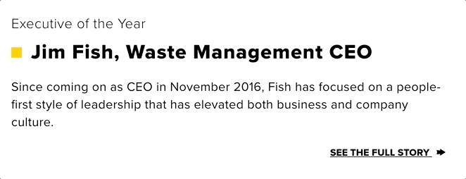
Finally, I decided to add one additional template for executive of the year. In the B2B world, there are a lot of headshots and I knew we would want to put a face to the executive of the year, so I rethought our Quick Facts section. To highlight the human element on these stories, I changed the “Quick Facts” flag to say “Profile,” updated the icon, added an image of the recipient and made room for a quote.
PROFILE PAGE
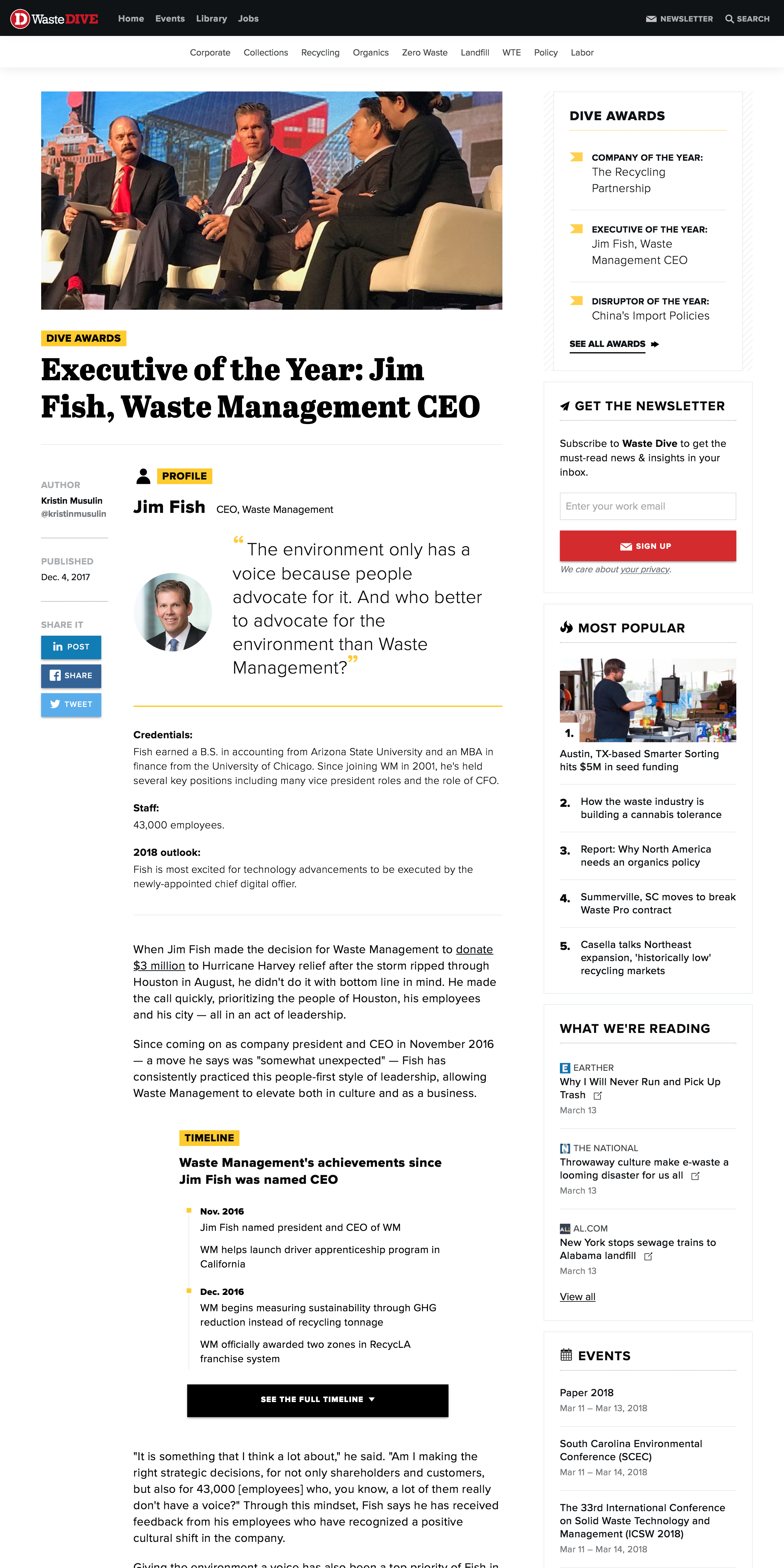 The executive of the year templates highlighted the awarded person with a headshot and career focused facts. See full article.
All of these enhancements created a strong presence for the Dive Awards and set the standard for subsequent years. Overall, the awards were a performance success with the week and individual articles leading the year in pageviews for many publications.
Special thanks to Front-End Designer Natalie Forman, who played a crucial role in helping me bring this to life.