CSS Grid for editorial design
CSS grid is on the rise if it hasn’t already made it. At Generate Conference in New York, Brenda Storer spoke on the utility of CSS Grid and gave an article application of the tool. Spending much of my time working with Industry Dive’s editorial team on story layouts, she inspired me to give it a go on one of my most recent creations.
Basic Article Layout
I started with the most generic layout in mind: an article centered on a page. CSS Grid can achieve the same results as the famed “margin: 0 auto.”
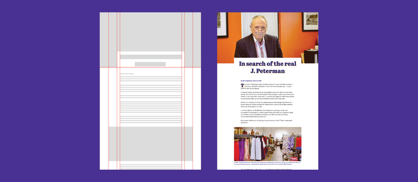
 CSS Grid can achieve a basic story layout with ease.
The overall structure is defined at the top level on my “article” element. There, “grid-template-columns” sets the number of columns for the article, as well as each column’s width. In CSS Grid, the width is often defined by the Fr unit of measurement, which is a fraction of the available space on a page.
To center an article on the page, I defined the width of my article and applied 1fr to either side of it:
article {
    display: grid;
    grid-template-columns: 1fr 700px 1fr;
}
To center the article and achieve the appearance of enlarged images in its body, I set the width of the body element and centered it using margin: 0 auto. I then added left and right padding to all article elements with the exception of images, to give them the desired enlarged effect.
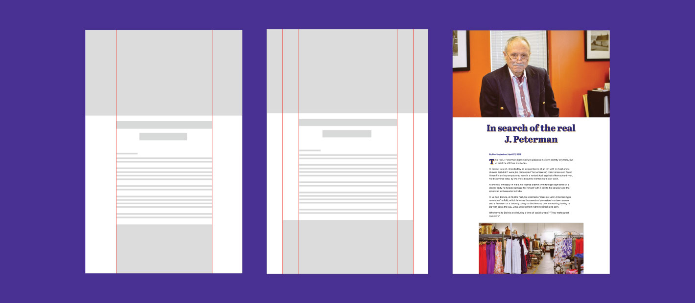
To achieve this layout using CSS Grid, I knew I would need a layout of at least 5 columns.
article {
    display: grid;
    grid-template-columns: 1fr 1fr 700px 1fr 1fr;
}
article > * {
    grid-column: 3;
}
The middle column accommodates the body of my article. The outer two units evenly centered it and the grid start column of 3 told the article elements to live in the third column. This gave me the same effect as margin: 0 auto in my template’s framework.
The first fr on either side of the body copy would allow for image expansion later in the article. Unlike margin, CSS Grid allows developers to use the negative space it creates. The ability to use the negative space informed how I would achieve both of my image treatments.
The header image needed to go full width and the body images should feel enlarged against the text of the story. I again used grid column, but this time I defined the start column and the number of columns the asset should span.
The header image began on the first column and spanned 6, creating a full width image. The in-article image started on the second column and spanned 5 to achieve the desired enlarged effect without the element going full width.
article > figure {
    grid-column: col-start 2 / span 5;
}
article > .header-img {
    grid-column: 1/6; /*abbreviated*/
}
Enhancing the Article Header
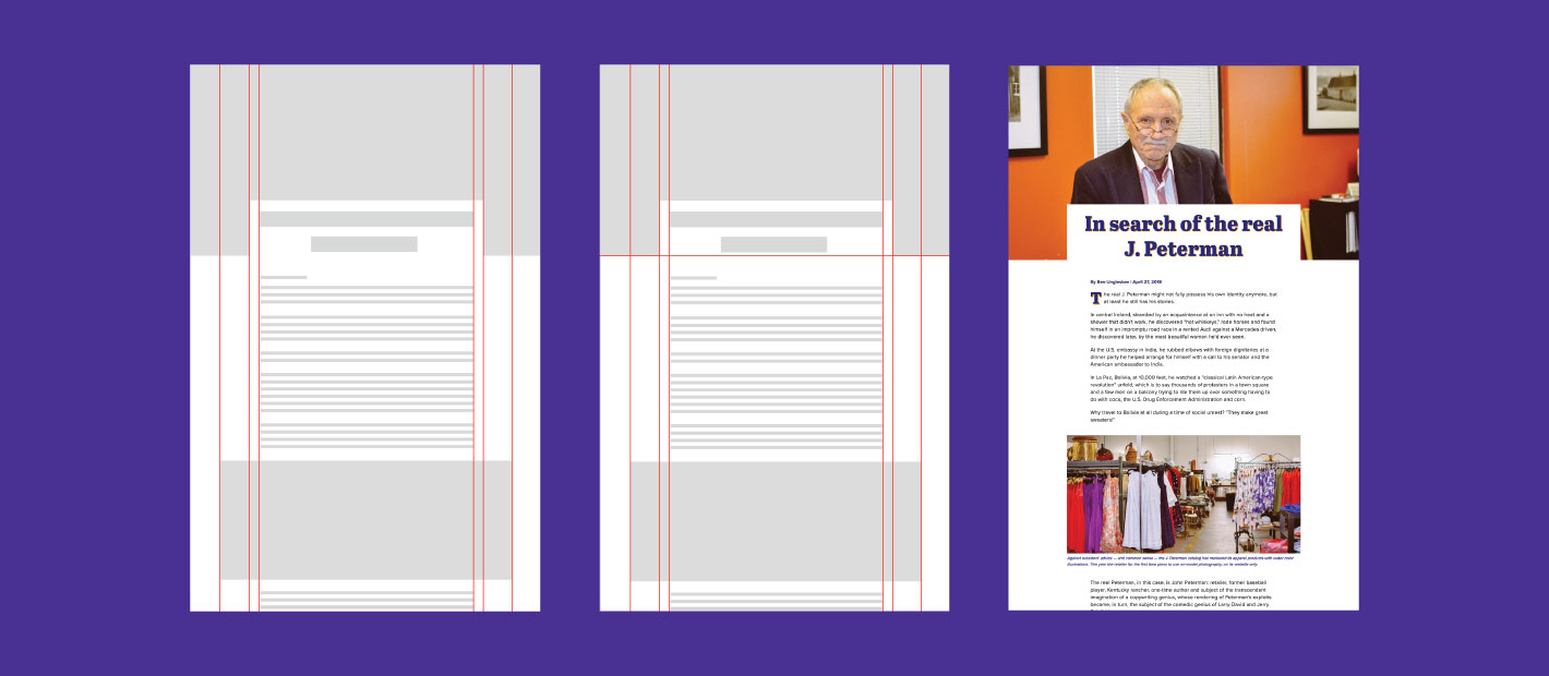 My design required a more complex grid to acommodate the header image style.
With my basic article complete, I moved on to the design of the header, which would require a little more complexity.
In the interest of transparency, I’ll share how I achieved positioning the header text half on and half off the header image without CSS Grid using absolute positioning and negative margin.
I know, I know probably two of the most controversial/frustrating/hacky CSS tools out there. But, it worked.
/* HEADER */
.header {
    position: relative;
}
.header h1 {
    left: 50%;
    margin-left: -400px;
    position: absolute;
    width: 800px;
}
CSS grid gave me another option for a similar design. To put the image and the title of my article on the same row, I defined the “grid-row” of my header image as 1. I did the same for my header text.
Because the image was larger than my text and therefore determined the height of my row, I used the align-self feature to bring the text down to the end of the row (or bottom of the image). This didn’t fully capture my original design but came close.
article > .header-img {
    grid-column: 1/6;
    grid-row: 1;
}
article > .header-text {
    grid-row: 1;
    align-self: end;
}
<article>
<img class="header-img" src="[image url]">
<div class="header-text">
        <h1>In search of the real <i>real</i> J. Peterman</h1>
        <span class="byline"> April 16, 2018 | By Krysti Shallenberger</span>
    </div>
</article>
My design still didn’t look quite right. I needed to add padding to my header text, but I wanted to do this while still keeping the copy aligned with the rest of the story.
I decided to build that padding into my framework:
article {
    grid-template-columns: 1fr 1fr 30px 740px 30px 1fr 1fr;
}
The header-text div now started at the third column and spanned three columns to encompass the 30px of additional space on either side of the body. This allowed me to give the header text a left and right padding of 30px while keeping its text lined up with the article, which still lived in the center column.
Benefits and Considerations
Features made easier by the Grid:
- Full-width and enlarged images are made much easier with CSS Grid. Without the Grid, the developer would need to use negative margin, my padding trick or break the container div altogether.
- Centering the article with CSS Grid is just as easy as margin: 0 auto; and allows you to structure the whole article using the same framework, resulting in cleaner code.
- CSS Grid allows you to use the negative space that other grids let go to waste.
The benefits noted, there were a few design choices I could not achieve with CSS Grid. I couldn’t replicate the appearance of my pull quotes, because CSS Grid does not allow for text wrap. I was also unable to position my header text half on and half off the photo and have the text maintain its position on resize.
There are also some accessibility concerns with the capabilities of CSS Grid, go here for more information.
Support
CSS Grid is pretty well supported at this point. However, depending on your project specs and what your company supports back to, you might want to provide a fallback.
At Industry Dive, we provide strong support for IE as many of our readers are in business or the government sector. I would need to provide a basic alternative structure.
You can do that by checking if the browser supports Grid. As Brenda Storer’s pointed out in her presentation, this is reliable, because the support for flex grid aligns with the support for feature testing.
@supports (display: grid) {
    /* CSS Grid Code */
}
Maybe a small sector of our readers won’t see my fancy pants design, but I think I’m willing to take that risk. Overall, CSS Grid was a successful article-building tool I will use in the future.