Increasing conversion through design
Industry Dive acquired Social Media Today in 2016. With a highly active community, the publication predominantly sustains itself on the news posts of social media’s industry leaders. Editors came to the design team concerned with the quality and volume of applicants who wanted to write for them.
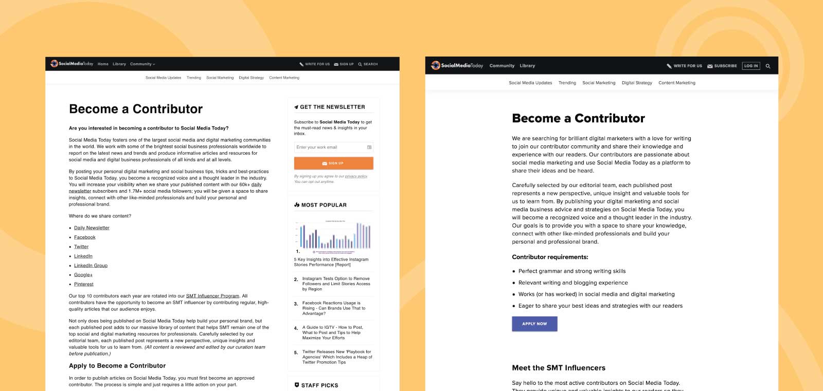
The design team began by analyzing the page that informed readers about the SMT community and encouraged them to write for us. Arriving on the page, a reader was presented with a large amount of copy aimed at explaining the community’s value, its activity on social media networks and a readers’ ability to post content on the site. Simultaneously, we were promoting the publication’s newsletter.
All of these goals conflicted and resulted in multiple calls to action. From these observations, the design team was able to minimize friction and provide clear direction to SMT’s prospective contributors, focusing on one goal: contributor acquisition.
 The initial concept of the contributor page that also contained information about the SMT community.
Informative and concise copy
SMT editors wanted contributors who were committed to providing readers with consistent and quality content. However, they didn’t want to reduce the number of applicants by providing a difficult process for consideration.
Economy of language
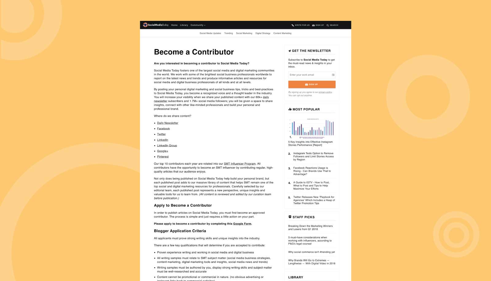
While informative and rich with information, the page required readers to sift through a dense wall of text that encouraged them to take multiple competing actions. To make the copy more consumable, design worked with the marketing team to consider the end goal of the page and remove any information that didn’t help readers make the decision to apply to write for us.
As a result, tips for a successful application were moved to the form where applicants would be considering their submission materials; information about getting involved with SMT’s social communities was spun off onto another page that would lead readers to engage with the community on social channels. By delivering the Become a Contributor program’s information quickly, readers were both informed and provided a quick route to action.
 The updated contributor page that works to increase conversions.
Encouraging prospective applicants
Strong signaling
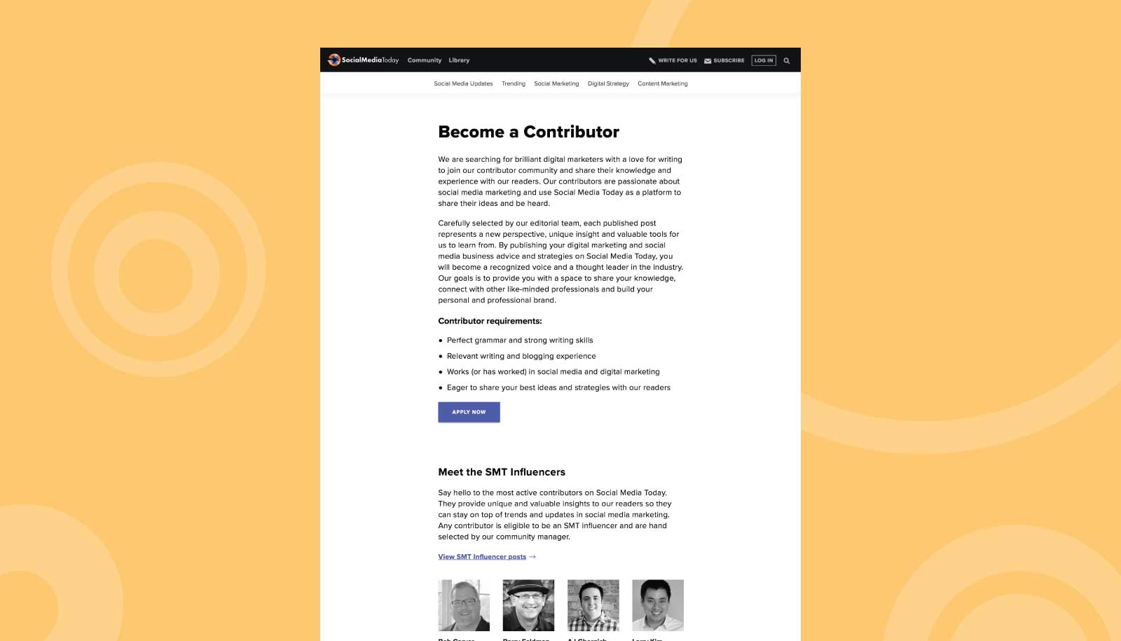
Once copy was finalized, we worked to make a clear call to action. The only visible call to action on the page was in the site’s sidebar, asking users to sign up for SMT’s newsletter. While subscriber growth is always an important goal, this was a rare occasion in which we wanted users to take a single, high-priority action.
By eliminating the sidebar, we could remove the newsletter sign up box and draw applicant’s attention to a single CTA. The CTA to apply was then converted from a link to a button to make it the strongest feature on the page and enhance its clickability, aligning with our design patterns.
Information hierarchy
The final touch on the page was a section where we highlighted SMT Influencers. These are the publication’s most active contributors hand selected by SMT editors. Their content gets highlighted across the site with a special “SMT Influencer” flag and all contributors are considered for this position. Not as important as the main call to action, the section acted as a sign off and gave readers more insight into the thought leadership benefits of becoming a contributor if they weren’t already convinced.
When designing to persuade a user to take an action, main considerations should include efficient and effective copy, strong signaling and information hierarchy. A combination of all three will lead to higher conversion rates and a better experience for users.