Re-examining web accessibility
When redesigning Industry Dive’s publication sites, our design team took into consideration previous feedback we’d received on how users would interact with the site. As designers, some of this feedback ran counter to what we thought was most aesthetically pleasing.
Still, our readers come from a number of backgrounds and making our site accessible to everyone was key. So among many updates to our content, we clearly defined the search, created a home button in addition to our logo and scattered breadcrumbs throughout the site to help users easily return to main section pages.
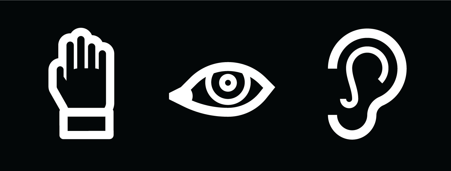
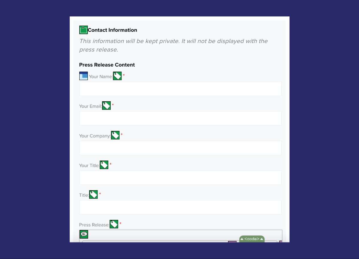
But that was just the first step toward accessibility. We also wanted to make our site more accessible for those with disabilities. To do this, we followed standard W3C accessibility best practices. To see where our site was compared to where it could be, I downloaded the WAVE web accessibility chrome extension. This tool allowed us to view the site as it would be seen by screen readers, which are software programs that can turn web content into speech or braille. It revealed that we had missed adding alt text on some of our images and that we had not applied labels to all of our forms (we were relying on placeholder text that screen readers don’t pick up in the inputs).
First, I went through the site and added alternative text to images so the reader could clearly know the function of the image, whether it was an “x” to close out of a window or an image to go with the story.
I then evaluated how we were currently labeling our forms. I decided to use the “for” and “id” method to make the labeling clearer for screen readers. I did this in addition to wrapping the input in a label, because some older screen readers and very old browsers might not support that method alone.
<label for="feedback">
	<span class="screen-reader-text">Message:</span>
	<textarea id="feedback" name="feedback"
	placeholder="Send us your feedback here" required></textarea>
</label>
I decided to use the “for” and “id” method to make the labeling clearer for screen readers.
The next dilemma was deciding between the aesthetic preference of placeholder text in the input versus label text above the input. For reasons of space constraint alone, I knew I didn’t want to add a visible label to every input and text area.
To hide the label text for standard users, but not screen readers, I hooked our label text with a span tag applied a clip path via CSS.
.screen-reader-text {
	clip: rect(1px, 1px, 1px, 1px);
	height: 1px;
	overflow: hidden;
	position: absolute !important;
	width: 1px;
}
To hide the label text for standard users, but not screen readers, I hooked our label text with a span tag applied a clip path via CSS.
I later discovered placeholder text is not supported in IE9, so I used a simple if statement to show the text I had covered up in browsers that did not support placeholder text. The team supports back to IE9, because Industry Dive’s user data shows that 4 percent of our audience uses the web browser, which equates to thousands of monthly users.
if (!('placeholder' in document.createElement('input'))) {
	$('span.screen-reader-text').removeClass('screen-reader-text')
	.addClass('screen-reader-text');
}
I later discovered placeholder text is not supported in IE9, so I used a simple if statement to show the text I had covered up in browsers that did not support placeholder text.
The final result was a site that included labels on all forms and made our images accessible with alternative text for readers with disabilities. We can always make enhancements and continue to A/B test our user’s experience, and we will as the site evolves in the coming months.
 We used WAVE (Web Accessibility Evaluation Tool), a Chrome plugin, to test our accessibility.